RGB vs. CMYK: Why Printed Colors Look Different Than Your Screen
One of the most common questions in printing is:
“Why doesn’t my print look exactly like it does on my screen?”
The answer comes down to how color is created.
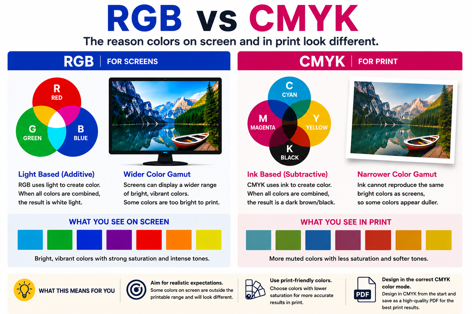
Screens use RGB color, which stands for Red, Green, and Blue. Phones, tablets, TVs, and computer monitors create color using light. Because screens are backlit, colors often appear brighter, more vibrant, and more saturated.
Printing uses CMYK, which stands for Cyan, Magenta, Yellow, and Black. Instead of using light, printers create color using ink on a physical material. Printed graphics rely on surrounding light to reflect color back to your eyes.
That difference is why printed colors can sometimes appear:
- darker
- softer
- less vibrant
- warmer or cooler than expected
Some bright colors you see on a screen simply cannot be reproduced exactly in print, especially:
- neon greens
- electric blues
- fluorescent colors
- highly saturated reds and oranges
Why Designing in CMYK Matters
For the best print results, artwork should always be created in CMYK color mode from the beginning whenever possible.
Designing in RGB may look great on screen, but when the file is converted for printing later, colors can shift unexpectedly. Bright tones that looked vivid on a monitor may print much duller because those RGB colors fall outside the printable CMYK range.
Starting your design in CMYK helps you see more realistic color expectations during the design process and reduces unwanted surprises when the final product is printed.
This is especially important for:
- brand colors
- logos
- large format graphics
- trade show displays
- vehicle wraps
- signage
- marketing materials
Why PDF Is the Preferred Print Format
When preparing files for print, exporting as a high-quality PDF in CMYK color mode is strongly recommended.
PDF files help preserve:
- fonts
- image quality
- layout alignment
- transparency effects
- vector artwork
- color settings
Unlike other file types, PDFs are much less likely to shift, reflow, or display incorrectly when opened on different computers or sent to production equipment.
Saving your artwork as a CMYK PDF also helps ensure the printer receives the file exactly as intended, leading to more accurate and consistent print results.
When working with print, clients can improve color accuracy by choosing CMYK-friendly colors from the start instead of relying on highly saturated RGB colors that may not reproduce well in print. One of the best ways to do this is by converting RGB colors to their closest CMYK equivalent before finalizing the design. Many design programs allow you to view both the RGB value and its closest printable CMYK version, along with the adjusted HEX color that better represents how the printed result will appear. While the printed version may never look exactly like a backlit screen, using a CMYK-safe color palette helps reduce major color shifts and creates a more predictable final product. This is especially important for brand colors, logos, and large format graphics where consistency matters. When possible, always preview your artwork in CMYK mode before exporting your final print-ready PDF.
Material and Lighting Also Affect Color
The same design printed on gloss vinyl, matte paper, fabric, or banner material can all look slightly different because each surface reflects light differently.
Lighting also plays a major role. A print viewed outdoors in daylight may look different indoors under fluorescent or warm lighting.
This is why professional print shops carefully prepare artwork for production and often recommend reviewing a proof before final output, especially for large format graphics and color-sensitive projects.
While RGB and CMYK will never match perfectly, setting up your artwork correctly from the start using CMYK color mode and exporting a print-ready PDF can dramatically improve color accuracy and help avoid costly surprises during production.

Leave A Reply